

The power of minimalist design
8 months agoBy SpartaFlow AdminMarch 15, 2026
A simple screen is not an empty screen. It is a screen where every element has earned its place, and everything else was removed on purpose.
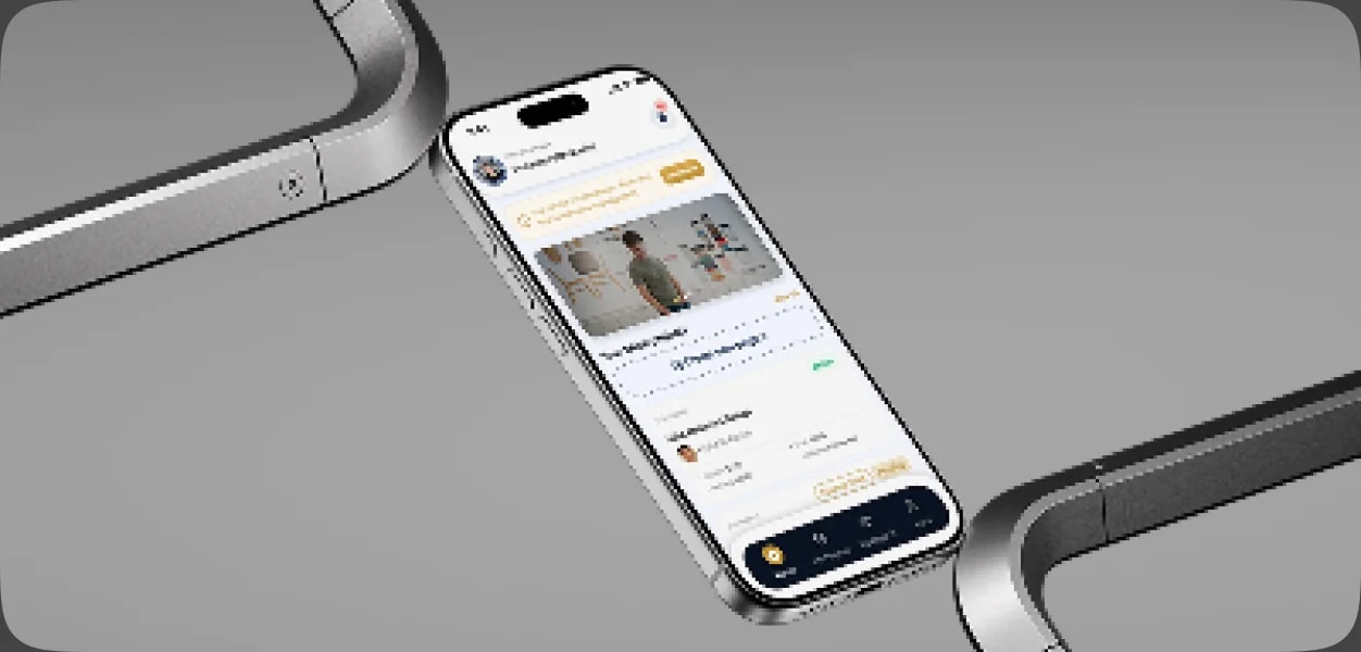
Less to read, faster to act
Every extra button is one more decision for the user. When a screen shows only what is needed for the task at hand, people finish it faster and make fewer mistakes, especially on a phone.
What minimalism really means
- Clear hierarchy: one main action per screen, and everything else visibly secondary.
- White space: room around elements so the eye knows where to look.
- Consistency: the same component behaves the same way everywhere.
- Honest content: short labels in the user's own words, not the system's.
Simple for the user, not for the team
Hiding complexity takes work. Behind a calm interface there is research into how people actually work, a design system that keeps every screen consistent, and testing on prototypes before a line of code is written.
Want an interface your users understand from the first visit? Contact us and let's design it together.